I have been working on some new pieces. Lately, I am into incorporating some of the ideas that I encountered in my design textbook. First, I have been looking at color. In this piece I was incorporating complementary colors. Those are the colors that are opposite each other on the color wheel.
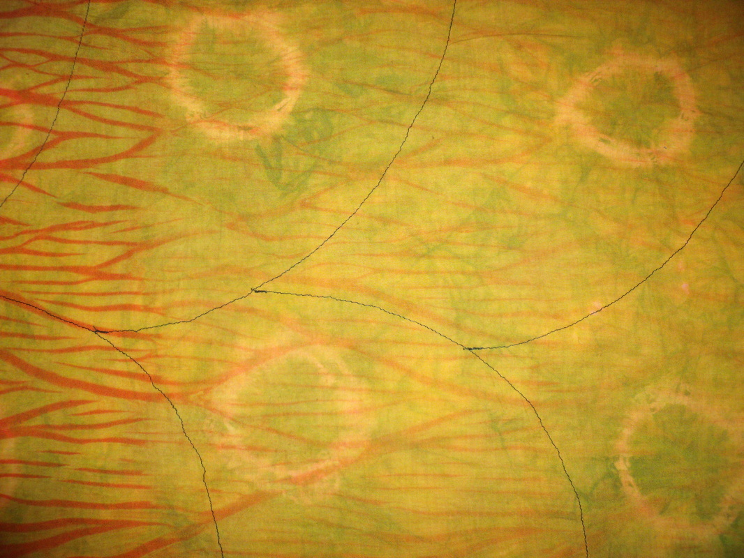
This one is a study of red and green. It's not particularly Christmasy, which is a risk when working with those two colors. The red was pole-wrapped and the green was tie-dyed. I machine-embroidered in black on top of that. I like the contrast of the two colors, along with the black.
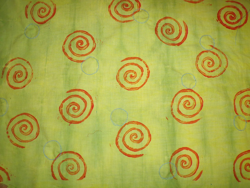
This one is a study of analogous colors, or colors that are next to each other on the color wheel. I started out with the yellow, which is pole-wrapped, and then pleated with green on top of it. Next, I added the orange swirls, which are block printed. This wasn't enough for the composition, so I added the machine-embroidered blue circles. In doing so, I actually created complementary colors, the blue and orange. I chose a circle for the embroidery motif because it was similar in shape to the swirls but not exactly the same. In this way, I incorporated both harmony and variety.
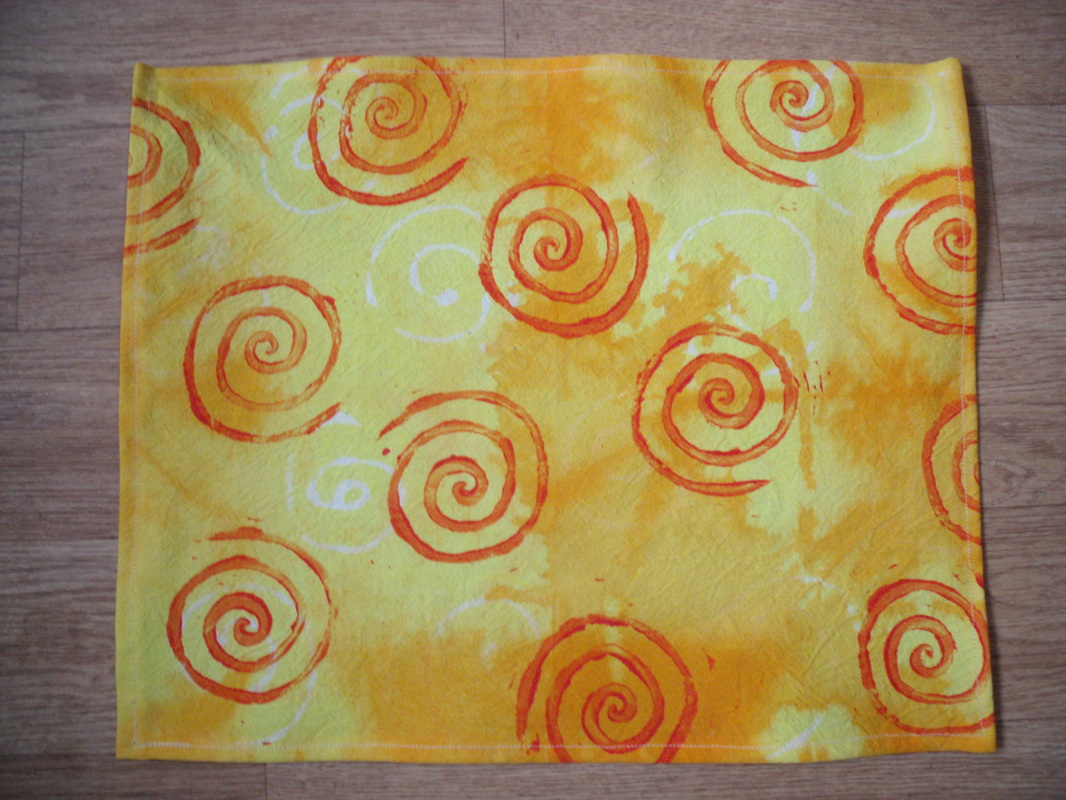
In this one, I fold-resisted in orange, added glue-resist swirls, and painted with yellow. Then I block-printed the orange swirls on top. This one shows analogous colors better than the last one, and uses more harmony than variety. I was a little disappointed with my glue-resisted swirls, because they are hard to see, but they turned out pretty well in the photo.
I am also working on a tablecloth for some friends. So far, it has taken me half an hour to pleat it, and then 45 minutes to tie it for tie-dye, and another half hour to take the elastics out.
I am also working on a tablecloth for some friends. So far, it has taken me half an hour to pleat it, and then 45 minutes to tie it for tie-dye, and another half hour to take the elastics out.
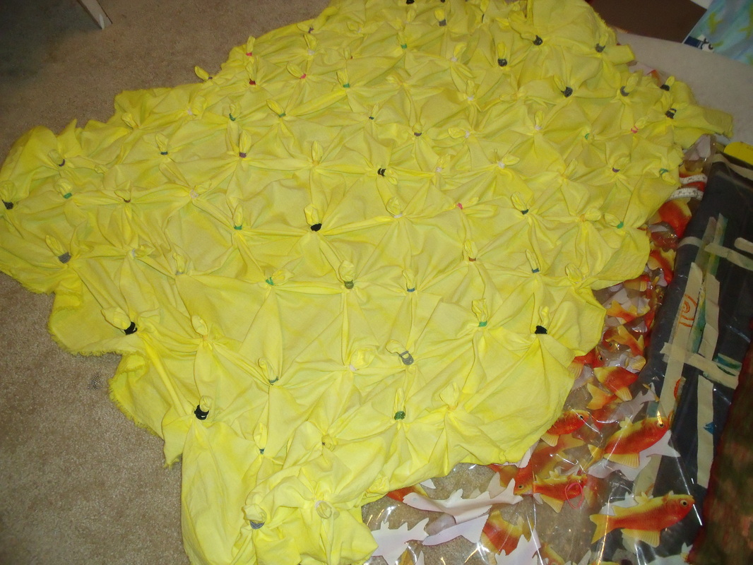
After tying for tie-dye. It's kind of pretty like that, but really not practical for a tablecloth.
 RSS Feed
