Day 21 took place over a number of days, as I've been sick with a nasty cold recently and haven't always had the energy I needed to do all my work. But I chipped away at it and this is the result. The information I am presenting is not in the order that I did it, but rather the order I can keep it all straight in my head.
My warm-up was to "listen to what nature was telling me". The book even suggested that I consult a book about nature omens. Now, I don't actually believe that there is a such thing as a nature omen, so I had to make of it what I would. It did occur to me that I don't spend a lot of time just observing nature and appreciating it. The book suggested that I do a visual journal entry about it, but I didn't even know where to begin, so I decided to go out with my camera. I figure that photography can be a kind of a journal, and I am eager to improve my photography. So I went for a walk with my camera and took pictures of nature changing for fall. I particularly liked the red red leaves and the squirrels that were so happy with their acorns.
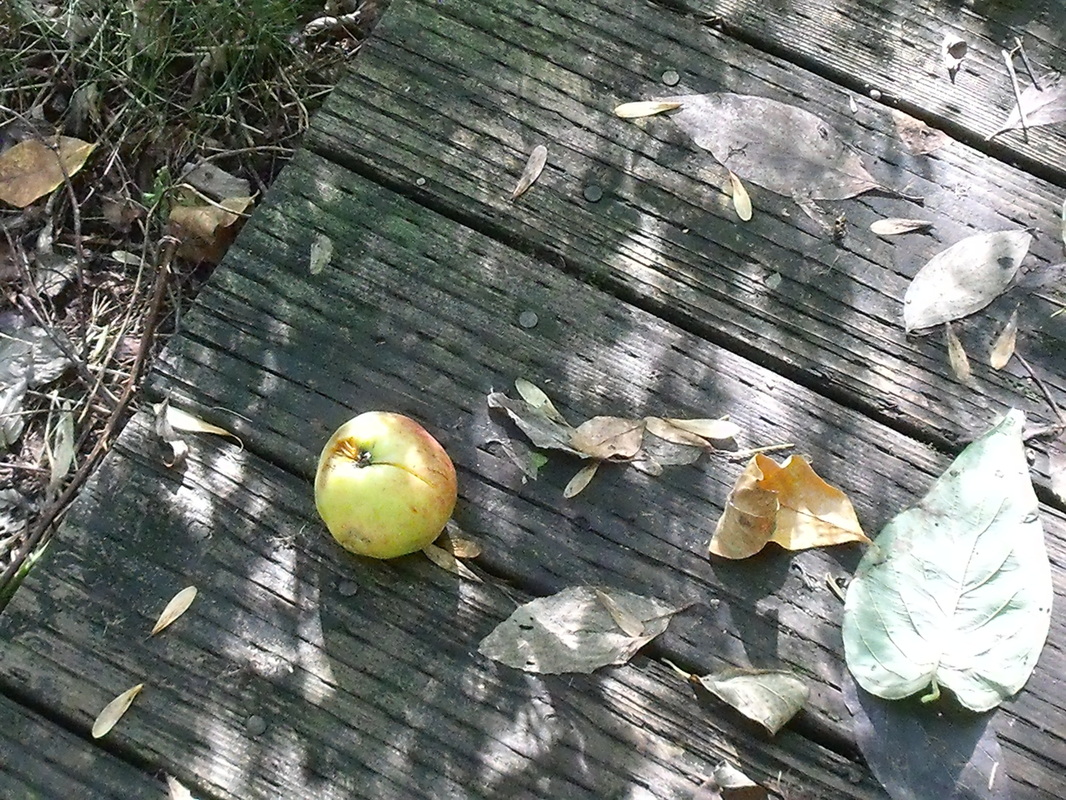
Autumn fruit.
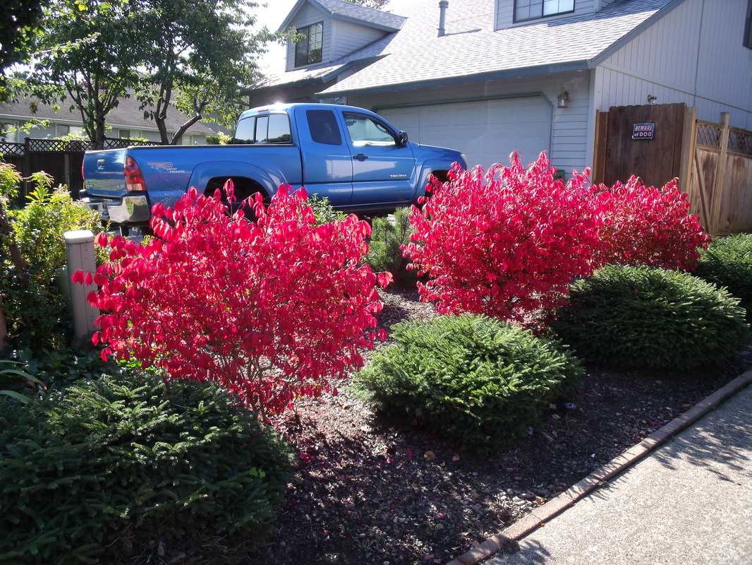
So red!
I watched a fantastic podcast about the Jawaja leather workers of India. They were doing a presentation via Skype, with a translator. Theirs was a very inspiring story. Thirty years ago, they were so low-caste that they weren't allowed to draw water from most of the wells. The traditional way of leather working in India is to scavenge for dead cows, as you're not allowed to kill a cow. So this was a despised profession. The leather workers were very poor. Their elders decided to ban the scavenging of dead cows and work on shoes (feet are kind of taboo in India) in order to raise their status. This had the unintended effect of making it even more difficult financially for the leather workers, as they had to buy processed leather, and couldn't sell as much. Eventually, they decided that they had had enough and began to work with design schools and craft councils. They helped develop products that could be marketed overseas. They began to sell to Maiwa and made enough money that they could eat twice a day (they were eating once every two days before that) and own houses. Since the presentation, customers have been so interested in the leather work that they have had to carry extra stock. Their bags and purses are very popular and they always have a large selection on their website. I was very happy to hear about the improvement of their lives and I hope they become even more prosperous. Their social standing in the village has also improved and now they are allowed to draw from all the wells. I have been working on a drawing of crumpled paper. This is going to take me a few days., I think. It requires a lot of concentration and patience. So far, I think it looks like cloth, but we will see how it looks when I am finished. I will post pictures as I have them. I watched more podcasts on the Art of Photography. The first one I watched was about scanning negatives, and it reminded me of my first full-time job as a digital scanner. It was a good refresher, and I learned about adjusting the histogram more finely than I did at work to improve detail in the photo. The next one I watched was on dynamic range, which is the range of values in a photo. Ideally there should be a wide range of values in order to show the most detail, unless you are doing high contrast on purpose. You can adjust the values in the computer to improve the range. The next one I watched was pretty cool, on tethered shooting. This is where you set up your camera to load pictures directly onto the computer so you can tell if they are exactly as you want them (it can be hard to tell on that little screen). That way you can adjust your settings to tweak the photo. This technique is used especially for catalogue photos. The final one that I watched was on time-lapse photography. It's very interesting because you have to set your camera up to take these photos at set intervals and then not touch it. You can't adjust the lighting levels or anything or it will look strange. There are programs that you can get for your computer that will play the time-lapse and you can make a little video. In my design book, I reviewed the chapters on shape and texture. In surface design, I am proud to say that I have my bolt of cloth! I have spent the last couple of days preparing the cloth and have cut the pieces for the order for my brother. I have also been working on dyeing some other pieces that I was experimenting on, and I am washing out those pieces now. It doesn't sound like I've done a lot but preparing an entire bolt of cloth takes a long time!
I sort of did this day over the span of two days. Yesterday was a holiday (Columbus Day in the US and Thanksgiving in Canada) so I only did a little work. Also, I'm having trouble with my productivity lately. I am learning stuff but not at the rate I would like. So I will see if I can ramp things up a bit over the coming week. I listened to two podcasts yesterday. The first one was about a Shibori artist from the UK. She worked primarily with Indigo, but also with iron rust. She does beautiful, intricate shibori work, which leaves me in awe. She takes quite a lot of time very carefully stitching, dipping multiple times in the dye vat, and then carefully undoing the stitching. You can see a little of her work and the kits she sells at http://www.callishibori.co.uk/. The next podcast I listened to was by a textile designer-turned cultural anthropologist who had a little money that would either let her work in her studio for six months or allow her to travel to India to study textiles. She didn't know which one she would rather do, so she flipped a coin. The coin "chose" the trip to India. She has traveled all over India, and has specialized in studying the block printers of the Kutch region in Gujarat. She specifically studied ajrakh printing. She absolutely loves traveling in India and has arranged many exhibits in the West. For business study, I watched some more of the Art of Photography episodes. The episodes I watched were all about developing film. I won't be doing that anytime soon, but it was a fascinating process to watch. The developing fluids were poured into a little light-proof case that held the film. There were three different fluids, but I can't remember what they all were. I wonder if photographers today miss this sort of process, or if they find Photoshop gives them better control. In design, I did a review of the chapter on form, doing sketches as I went. I looked at variety, balance, and dominance. It was a good review to make sure I understood the terms. I will have to give this book back to the library soon so I need to finish my review to make sure I understand all the concepts. Finally, I finished off some bookmarks, as well as a sample of a project that I am doing for my brother and sister-in-law. I worked on a few other items as well, applying the glue resist, stitching embroidery, and the tedious work of ironing everything. I find that working with cloth is half tedium and half creativity. It's a bit like cooking, where you spend half your time creating and half your time cleaning up or doing repetitive chopping or something. When I put on some music and daydream, the tedious stuff is not so bad, and I can get excited that it will lead to creative stuff. Anyways, I took some photos of my finished objects. 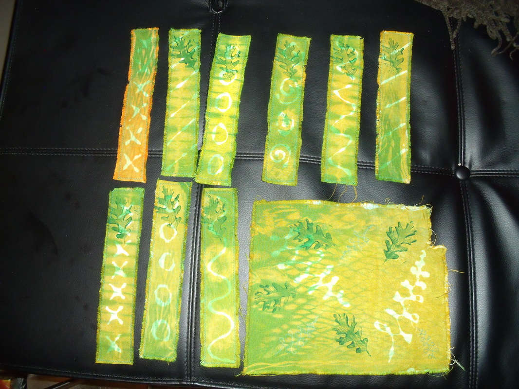 Bookmarks and sample. In the future, I will leave the leaf print off the bookmarks, as I feel that it takes away from rather than adding to the design. 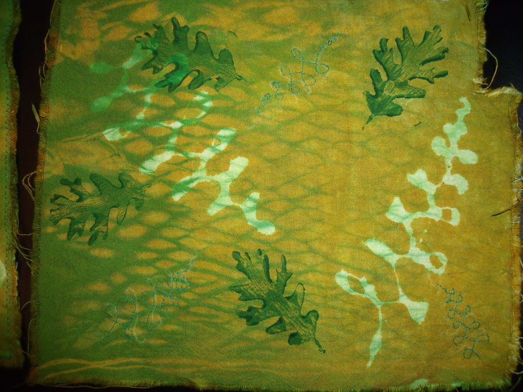 Close-up of sample. Pole wrapped and dyed, glue resisted, overdyed, printed, and machine embroidered.
Yesterday, I had a great experience with my friend Amber. We sort of had a skills-exchange party. Amber showed me some things about sewing and I showed her some things about knitting. We had a great day. I made a pillowcase, which doesn't actually fit any of our pillows. I know how to do it now though. Not difficult at all. From soup to nuts I think it took me under an hour. We also worked on a skirt (just the muslin, I don't intend to wear it). Anyways, I had such problems with the pattern and the book that I think I am going to quit this one and make something else instead. I have another book that the pillow pattern comes from, which might be a better fit for me. Also, Amber left some patterns for me to try, so I'm going to give those a whirl. I hope we can have another skills exchange party again soon!
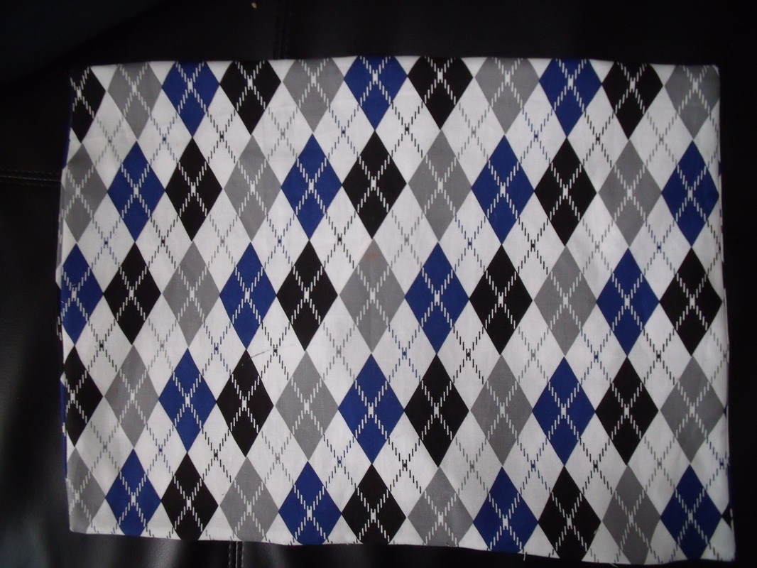
The front of my pillowcase. I like argyle.
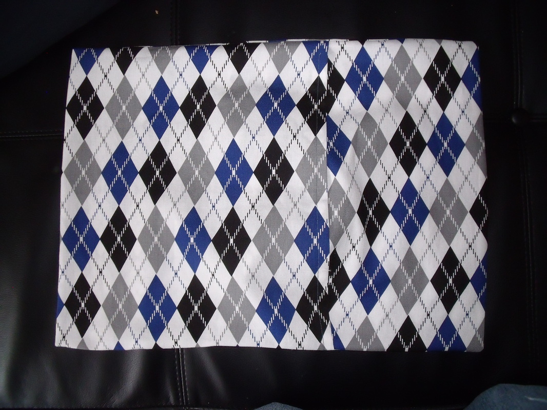
The back, with envelope opening showing. That's how you get the pillow in.
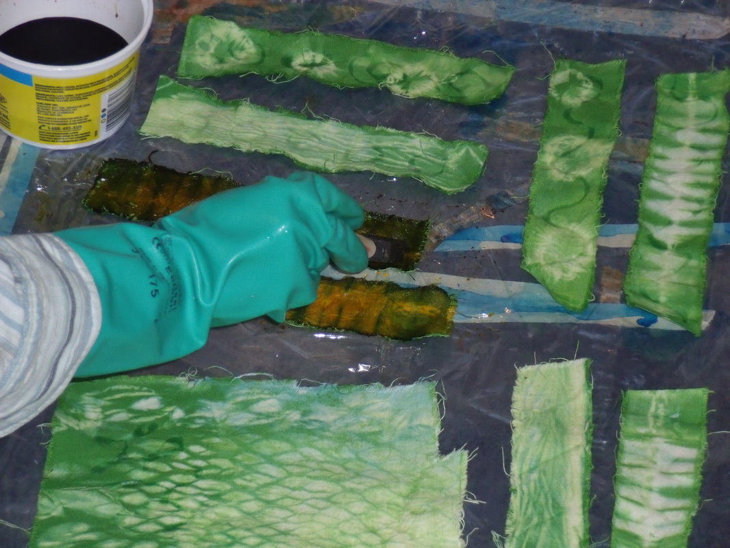
For my business study today, I watched four more episodes on The Art of Photography. The first episode was on filters, which are more appropriate for film cameras than digital. With digital, it is more effective to use Photoshop than a filter. The second episode was on metering without a light meter, which involved changing the aperture and the f-stop. I also learned that lots of photographers take slightly darker and lighter photos to make sure that at least one turns out as they had hoped. The third was on a photographer who put together a book called The Americans, and had sort of a photojournalistic style. Finally, the last one was about composition, and there were many elements to it other than the rule of thirds. One thing that stood out was the use of triangles, often creating points with eyes. Most of these triangles were right-angle triangles. Another think I liked was the use of curves in photos, usually on one of the stress points created by the thirds. I finished the last chapter in my design book, and will be going back to invent exercises for each chapter to make sure that I have grasped the concepts. This last chapter was on time and motion. It was a pretty short pattern. Motions on the picture frame are intended to slow down the gaze of the viewer, who will usually try to look at something quickly. Motion can be implied by line direction or shape position. The sequencing of images gave rise to animation and moving pictures. Some artists, such as the Cubists, tried to give the impression of moving around the subject by showing multiple viewpoints. This can be seen in Cezanne's works, where parts of the table don't line up and where some objects are viewed head-on and others are viewed from above. Sometimes images are superimposed or blurred to give the impression of moving around the subject or to suggest motion. Think of cartoons in which the character runs, and his feet turn into multiple feet moving very quickly. The chapter has a short history of moving pictures, which I won't get into here, and also discusses video artists. Additionally, computers and multimedia can be used in art now. Motion can also be implied in three dimensional work, again by showing multiple viewpoints. Additionally, there is kinetic art, which is usually sculpture that actually moves. In dyeing today, I had an interesting experiment: trying to make brown. Theoretically, brown should be dark orange. I don't have black to add to orange (which I can make with red and yellow). What I did was to mix up some golden yellow, which is close to orange, and added a tiny bit of blue and a tinier bit of red. The dye looked pretty brown but it seemed a bit on the orange side when I painted it on. I won't know exactly what the color will be until I've washed out the dye. I am hoping it will be brown, but I can keep mixing if not. I didn't saturate my cloth with dye so I'm hoping I can dye it once more if it's not brown enough.
The bottom one turned out very orange. I tweaked it a bit after that.
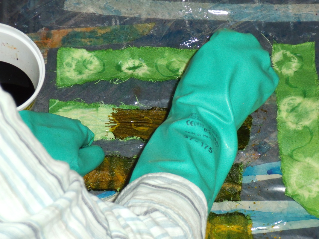
Looking browner, but still a bit orangey on the resist. We will see.
Started a bit late this morning, but got everything done that I wanted to do. For business study, I watched more podcasts from the Art of Photography. The first one was on handheld light metering. I don't have a light meter but I can see that it might be a good investment in the future. A light meter helps you decide how to arrange your aperture and shutter speed. My camera has a built-in light meter in it, as probably does yours. When this is the case, the camera "decides" automatically on the shutter speed and aperture. Again, that's not something I have control over in my point-and-shoot but it is something to be aware of. The other two podcasts I watched were about lenses. All cameras have lenses, and most actually have more than one inside. On an SLR you can change the lenses to suit your needs. My camera doesn't have this option, but it does have settings that simulate different lenses. I don't know if these have problems with distortion or not, but I expect they would because all lenses cause some type of distortion. The trick is to get the distortion you want for your particular photo. These podcasts make me really want an SLR! But that is not an option at the moment and I can live with what I have. I haven't always been lucky enough to have any camera at all, so I can't really complain. In my design book, I studied space. I actually started studying the chapter a couple of days ago but didn't finish it until now. There is a lot of wordiness that I didn't understand in this chapter, but I understood as soon as I saw the picture illustrating it. Unfortunately, I can't show you the pictures from the book, so my words will have to do. There are two major types of space in two-dimensional art: decorative space (flat-looking surface) and plastic space (looks like it has depth). Plastic space is further divided by shallow space and deep or infinite space. Shallow space looks like the picture has some depth, but not very much. The artist might have manipulated some tricks to make the image look flat. Deep space looks like how we would actually see something in the real world (again, the artist uses tricks to make us think that it is as we would see it) and infinite space is just what it sounds like. There are spacial indicators. Sharp detail looks close to us, and diminishing detail looks far away. Larger items appear closer than smaller items. The position of a shape can make it appear closer: the horizon line is usually at eye level, so shapes below that on the canvas appear closer than shapes above it. If an item is overlapping another item, it appears closer. Transparency can be used with overlapping items to make them appear closer. Interpenetration is when planes or objects pass through each other, and depending on what is pictured, can create shallow or deep space. Fractional representation, which is seen in ancient Egyptian art, is when we picture a subject using those parts that best represent it in our heads. For example, in Egyptian paintings the head is a side view while the eye is full on, the torso faces forward but the hips and legs face the side. Converging parallels is when two sides of an object, which we know to be parallel, have sight lines pointing toward the same vanishing point. Linear perspective is a way of representing sizes and distances of objects in space. There are three major types of linear perspective: one-point, two-point, and three-point. One-point perspective has a single vanishing point in the picture, and was used frequently in Renaissance art. Two-point perspective has two vanishing points, usually located off the canvas. A view of a city might be a good example of two-point perspective. Three-point perspective is used when an exaggerated view is pictured. This can either be bird's-eye view or worm's-eye view. There are formulas for making sure that shapes in the picture will be spaced in a way that seems to suggest distance to our eyes, which I won't get into because there are so many of them. There are some disadvantages to linear perspective: it does not actually show things as we see them, you can only see things from one position in space, it can be monotonous, and the items pictured are distorted. There are other projection systems as well. Oblique projection does not have vanishing points, but does show a the side as well as the front of a shape, with the side at a 45 degree angle. It is used by engineers and architects. Isometric projection shows two sides of the object, both at 30 degree angles, as well as the top. Again, there are no vanishing points. It is used by drafters. Orthographic drawing, all objects are drawn perpendicular to a base line. It is used in engineering and industrial settings. Reverse perspective is seen in traditional East Asian art, in which the back of objects are wider than the front of them. Intuitive space is the creation of space without rules or guidelines. Lines can create space, appearing to recede or advance. Shapes can create space through overlapping. Value can create space as well: usually the lighter something is, the closer it appears, and the darker it is, the further away it seems, although this can be reversed. Texture can influence space: sharp, clear, and bold indicate closeness, and fuzzy, dull, and small textures usually suggest distance. Color can also indicate space: analogous colors create limited space, while contrasting colors create a lot of space. There is a way to create space called structured ambiguity, in which the shapes in the foreground and background seem to switch depending on what colors are around it. For this reason, beginning artists are usually encouraged not to frame their work with a black mat. Space is also crucial in three-dimensional work. Sculptures could be flat, or they could have open voids. They can be spaced apart enough that the viewer has to walk around or through them. Instillations are works that the viewer has to walk through to experience, and they use space as part of the art. I worked some more on my commissions and items for my online store. I had a lot of fairly boring work to do, involving prepping the fabric. However, I did get to do a bit of dyeing, all immersion this time. I am doing some pole-wrapped bookmarks and some tie-dyed ones. I also did a pole-wrap of a sample for the commission I am doing for my brother and his wife. They want green and brown natural-looking placemats and napkins, but they wanted to see a sample first. Fair enough: this gives me a chance to work out any kinks (like, how do I make brown?) before I start working on their actual project. I also washed out a cloth I dyed yesterday, using pleating, but it currently looks so unimpressive that I didn't bother to take a photo. I will use it to figure out how to create layers when the background color is dark.
Sorry for the delay in posting this week. It’s been a crazy week so far and I haven’t been able to blog so far.
Monday, I wasn’t feeling well so I took a day off.
Tuesday was a bit nuts because I was preparing for my trip. The trip I am on now. I started out with business study, in which I watched several little podcasts on photography. I hope this improves my sucky product photos. So far, most of the podcasts have been about different cameras (none of which I possess) and the history of cameras. This is all interesting background info, but hasn’t really helped me yet. One podcast that did help me was about the rule of thirds in composition. I had heard of the rule of thirds but didn’t really understand it, so this was a great explanation. Basically, on a picture frame, things look really good when you divide the surface area into equal thirds and base your subject(s) in one or two of those areas. You can divide the surface horizontally, vertically, or even diagonally. The spots where horizontal and vertical thirds intersect are especially interesting points onto which you can place an important feature (such as eyes in the case of a portrait). I am not yet sure how this knowledge will affect my product photos, but I hope it will in the future.
In design, I finished the chapter about shape. I looked at proportions and economy. Sometimes artist will break a work down into planar shapes, perfecting each layer of work before moving onto the next. This helps the artist understand the relationship of all the shapes to each other. Shape can also be used for expressive content. Viewers react with different emotions to different shapes. Sometimes these reactions are shared with other viewers, and sometimes they are more personal. The meaning of shapes can be altered by the shapes themselves, by their colours, or by their values. In three-dimensional work, shape not only means the actual shape of the object, but also the shapes of the negative areas that are left by the work. Shapes can depend on the shadows they cast. The shapes also depend on the viewer’s position. A shape to take into consideration is the silhouette of the work.
Wednesday, I was in transit for most of the day so my studies were limited by that. I listened to a podcast about a French gardener who has a sort of dyestuff demonstration garden. He works with a botanist to try to grow every kind of plant that is used for dyeing, or at least as many as possible (henna, for example, doesn’t do very well in his climate in Provence). His garden is the main tourist attraction in his tiny village. A lot of his work with the public is about educating people on the uses of his plants. Different dyes can be used in different ways, and artists are always coming up with new and innovative ways to use the plants. Often, the traditional recipes can’t be used anymore because that is no longer the way dyes are used (he didn’t explain what he meant by that, but it could have something to do with increased safety practices over time, or the availability of different products that have to do with dyeing). His garden receives some funds from the government in the form of grants, and also from the dyeing association he belongs to. In this part of the podcast, he was looking for additional ways to raise money, and he was pretty sure he didn’t want to open a gift shop and sell traditional Provencal gift shop items such as lavender and goat cheese!
In design, I studied the chapter on value. I was excited about this chapter, as I am only sort of familiar with the concept of values. Value means, basically, relative degrees of lightness and darkness. The chapter mostly looked at black and white (and infinite shades of grey) values, also called achromatic values. The chapter includes a value scale that I can photocopy and use to help with my drawing. The lighter shades, from white to middle grey, are known as high-key values, and the darker shades, from middle grey to black, are low-key values. It will probably take me a little while to remember which is which. Some works use a limited range of values for dramatic effect, such as using only low-key values to create a somber mood. Different values can be achieved with different media, such as pencil, charcoal, or chalk, wet or dry, direct or blended, with lines or with shapes. Etchings can create strong contrasts between light and dark, as can woodcuts and screenprinting. The use of different values on a two-dimensional work can create the appearance of three-dimensionality. These are referred to as plastic values. Cast shadows are an important part of the composition of a work, as cast shadows in the wrong places can create a mess out of the image. Similarly, when there are not enough cast shadows, the image looks flat (which may or may not be a desired effect). The technique of gradually blending contrasting lights and darks is called chiaroscuro. This effect creates spaces that recede in the works. Tenebrism is extreme or exaggerated chiaroscuro, such as in the works of Rembrandt. Some art deliberately uses different values in such a way that they create a shallow space, as you can see in many traditional Asian artworks. Value pattern is a way of using dark and light values to create a pattern on the surface of the work, and can be used as a compositional element. Sometimes it is difficult for artists to see what kind of values they are using in colour, and when the work is translated to black and white, the values can be too similar (although that might also be a deliberate decision.) A closed-value composition means that values are contained within shapes which are used to contrast with one another. An open-value composition means that values cross over one another. Values are used in three-dimensional works in the shadows that they cast, or by the paint on the surface of the work.
I will not be able to do any surface design while I am on my trip. I have brought up some drawing tools, as well as my business book, my podcasts, my design book, and a little knitting. I hope to keep working on these subjects while I spend time in Canada trying to keep my status as a visitor in the United States legal. I can’t yet afford the fees for a spousal Greencard but I am chomping at the bit to get one so I can stop pissing myself every time I cross the border. I really hope I get back in again, as my husband and my stuff are stateside!
|
 RSS Feed
