Well, my trip is getting in the way of schooling, as you can imagine. Between all the tasks I have to do and all the people I want to visit, this has been my first full day that I could do any schoolwork.
I should backtrack and let you know about a podcast I listened to last week. It was about a couple who grew and dyed with woad. Woad is a flowering plant whose leaves give off a pale blue dye. The couple had no background in dyeing, but they had bought a house in rural France and found a windowpane that had been painted a pale blue colour. They wanted to learn about this blue, and found out that it was woad. They have been in love ever since. Woad is paler and harder to work with than indigo, so it is not used much anymore. It has a long history of use, however, before indigo was common in Europe. Like most natural dyes, the dye had to be “fixed” using a mordant. In the middle ages and the renaissance, the mordant that was used was stale urine. The woad dyers would pay the townspeople to go drink beer for a whole weekend and then come back and pee into a barrel. A man who did this was called a pisser. I’m not joking! Anyway, the smell was bad enough that woad had to be prepared far from any houses or inhabited areas. Woad was also used in paint, and the first pastel crayons were made of woad suspended in other materials. The word “pastel” comes from the French for woad, pastel.
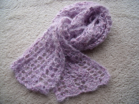
I should also show you some photos of some of the stuff I have been working on in the past few weeks that I had to conceal because it was destined for another person. Here are two of those things: first, the lace scarf that I knit for my stepmom:
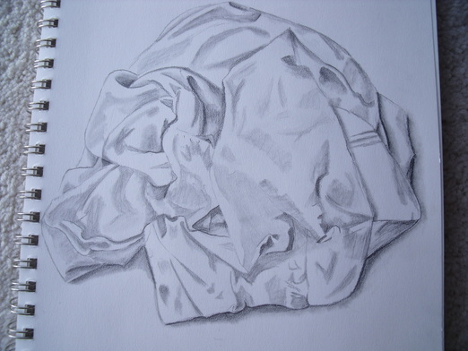
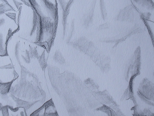
 Tied view. 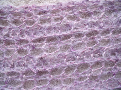 Close-up. The second one is the (rather short) scarf I wove for my mom: 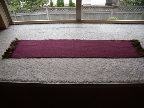 Full view 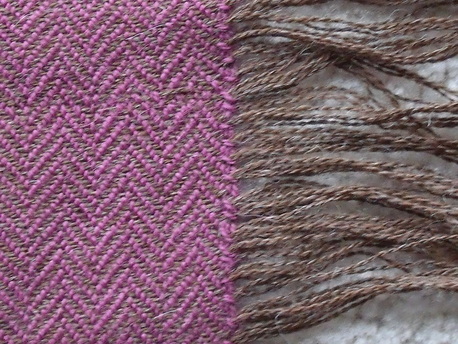 Close-up with fringe. Today, I started off listening to another podcast. Unfortunately, it wasn't fantastically edited. It was exerts from a lecture about the textiles found on some mummies in China. I was really looking forward to it because the lecturer was the author of a book I'd really like to read, Women's Work: the First 20,000 years (her name is Elizabeth Wayland Barber). I heard her speak a little about the mummies, and about how well preserved their clothes were, but not much about the clothes themselves. She talked a little about how weaving spread from Mesopotamia to China, and then the lecture cut to a rather amusing tale about trying to chase down a rare sheep at a zoo for a fiber sample, and how she learned that the first wool for textiles could not have come from the sheep because the fiber was too delicate to spin. It sounds like it would have been a great lecture to attend but there must have been some time constraints for the length of the podcast and unfortunately, I didn't really get anything that I think would add to my education. It is a good reminder that I should look up the book though, which is as much a part of art history for me as a book about Manet would be. Next I read my design book. The chapter I was reading was on texture, which wasn't something I had really considered before. Some texture is implied, as on a two-dimensional surface, but it is very real on a three-dimensional surface. Sometimes paint can be used to create actual texture by layering with thick paint and using tools such as palette knives. Also, sand can be added to paint to make it more textured. Early in the 20th century, paper was added to paintings, a technique called paper colle (there should be an accent on the last e of colle). This led to collage, in which all sorts of items were added to paintings, such as rope or chair caning. Today, artists may use materials such as nails or other unlikely subjects. Simulated texture is texture that looks real but cannot be felt with the hand. These are imitations of actual texture. Abstract texture is artificial texture that does not imitate real life, but is symbolic of something we would see, such as simplified woodgrain. Invented texture does not look like anything known; instead, it comes from the artist's imagination. Texture can be combined with pattern to create a pattern on a three-dimensional surface, such as a rug with raised tufts where polka-dots are, or engraved swirls on a sculpture. Texture needs careful consideration in composition because texture can be so distracting that it can take away from the rest of the composition, so it needs to be carefully balanced. The composition needs to have rests, or places where the eyes don't need to look too hard, or the composition will look cluttered. Textures can imply space too: blurred, low contrast texture suggests distance, and sharp, strong contrast texture suggests closeness. Textures can have psychological implications. Texture is especially important in three-dimensional work such as sculpture. There is a type of sculpture called an assemblage, which is sort of like collage except that it is usually viewed in the center of the floor rather than on a wall, and can be viewed from many angles. It usually involves some found and some made materials. When assemblage is in a painting format, it tends to project from the wall. Texture can be used to trick the viewer into thinking that they are looking at another material, such as a realistic ceramic sculpture of a leather jacket hanging on a wall. I also discovered that my textbook has a corresponding interactive website: www.mhhe.com/artstudio. It's not quite as instructional as I would like, but I suppose if it was, there would be no reason to buy the textbook! However, I look forward to using the site to review once I am finished the book. Next, I finished off a drawing I have been working on since I arrived. I am quite pleased with it. I did it after I read the chapter on value. Although I did not use a value finder, the study helped me immensely. I look forward to making the value finder and improving my drawing even more. I should note that I used my blending stump as much as I used my pencil for this one. 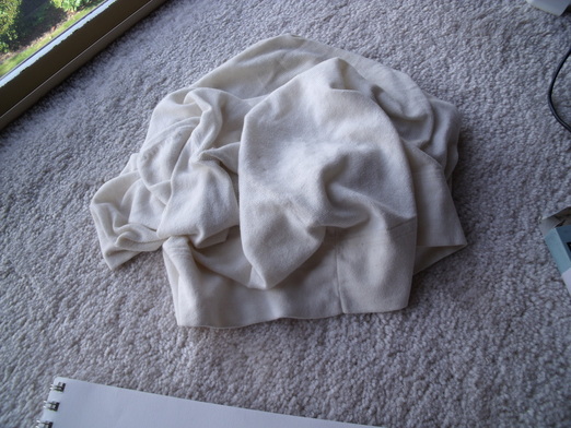 The subject. It was a cardigan that I fluffed and plopped down. Then the cat sat on it and I had to fluff it very carefully again. Finally, I worked on business study. My dad is an Excel genius and he helped me create a spreadsheet with my business plan. This is very handy, as I can tweak numbers here and there and the entire thing will recalculate itself for me. It's going to save me a lot of time! I asked my dad to create the spreadsheet for me but I suppose he took the "teach a man to fish" approach. I'm glad he did because it's not that difficult and now I can create any kind of spreadsheet I want.
Looks like tomorrow will be another free day. More studying then!
Sorry for the delay in posting this week. It’s been a crazy week so far and I haven’t been able to blog so far.
Monday, I wasn’t feeling well so I took a day off.
Tuesday was a bit nuts because I was preparing for my trip. The trip I am on now. I started out with business study, in which I watched several little podcasts on photography. I hope this improves my sucky product photos. So far, most of the podcasts have been about different cameras (none of which I possess) and the history of cameras. This is all interesting background info, but hasn’t really helped me yet. One podcast that did help me was about the rule of thirds in composition. I had heard of the rule of thirds but didn’t really understand it, so this was a great explanation. Basically, on a picture frame, things look really good when you divide the surface area into equal thirds and base your subject(s) in one or two of those areas. You can divide the surface horizontally, vertically, or even diagonally. The spots where horizontal and vertical thirds intersect are especially interesting points onto which you can place an important feature (such as eyes in the case of a portrait). I am not yet sure how this knowledge will affect my product photos, but I hope it will in the future.
In design, I finished the chapter about shape. I looked at proportions and economy. Sometimes artist will break a work down into planar shapes, perfecting each layer of work before moving onto the next. This helps the artist understand the relationship of all the shapes to each other. Shape can also be used for expressive content. Viewers react with different emotions to different shapes. Sometimes these reactions are shared with other viewers, and sometimes they are more personal. The meaning of shapes can be altered by the shapes themselves, by their colours, or by their values. In three-dimensional work, shape not only means the actual shape of the object, but also the shapes of the negative areas that are left by the work. Shapes can depend on the shadows they cast. The shapes also depend on the viewer’s position. A shape to take into consideration is the silhouette of the work.
Wednesday, I was in transit for most of the day so my studies were limited by that. I listened to a podcast about a French gardener who has a sort of dyestuff demonstration garden. He works with a botanist to try to grow every kind of plant that is used for dyeing, or at least as many as possible (henna, for example, doesn’t do very well in his climate in Provence). His garden is the main tourist attraction in his tiny village. A lot of his work with the public is about educating people on the uses of his plants. Different dyes can be used in different ways, and artists are always coming up with new and innovative ways to use the plants. Often, the traditional recipes can’t be used anymore because that is no longer the way dyes are used (he didn’t explain what he meant by that, but it could have something to do with increased safety practices over time, or the availability of different products that have to do with dyeing). His garden receives some funds from the government in the form of grants, and also from the dyeing association he belongs to. In this part of the podcast, he was looking for additional ways to raise money, and he was pretty sure he didn’t want to open a gift shop and sell traditional Provencal gift shop items such as lavender and goat cheese!
In design, I studied the chapter on value. I was excited about this chapter, as I am only sort of familiar with the concept of values. Value means, basically, relative degrees of lightness and darkness. The chapter mostly looked at black and white (and infinite shades of grey) values, also called achromatic values. The chapter includes a value scale that I can photocopy and use to help with my drawing. The lighter shades, from white to middle grey, are known as high-key values, and the darker shades, from middle grey to black, are low-key values. It will probably take me a little while to remember which is which. Some works use a limited range of values for dramatic effect, such as using only low-key values to create a somber mood. Different values can be achieved with different media, such as pencil, charcoal, or chalk, wet or dry, direct or blended, with lines or with shapes. Etchings can create strong contrasts between light and dark, as can woodcuts and screenprinting. The use of different values on a two-dimensional work can create the appearance of three-dimensionality. These are referred to as plastic values. Cast shadows are an important part of the composition of a work, as cast shadows in the wrong places can create a mess out of the image. Similarly, when there are not enough cast shadows, the image looks flat (which may or may not be a desired effect). The technique of gradually blending contrasting lights and darks is called chiaroscuro. This effect creates spaces that recede in the works. Tenebrism is extreme or exaggerated chiaroscuro, such as in the works of Rembrandt. Some art deliberately uses different values in such a way that they create a shallow space, as you can see in many traditional Asian artworks. Value pattern is a way of using dark and light values to create a pattern on the surface of the work, and can be used as a compositional element. Sometimes it is difficult for artists to see what kind of values they are using in colour, and when the work is translated to black and white, the values can be too similar (although that might also be a deliberate decision.) A closed-value composition means that values are contained within shapes which are used to contrast with one another. An open-value composition means that values cross over one another. Values are used in three-dimensional works in the shadows that they cast, or by the paint on the surface of the work.
I will not be able to do any surface design while I am on my trip. I have brought up some drawing tools, as well as my business book, my podcasts, my design book, and a little knitting. I hope to keep working on these subjects while I spend time in Canada trying to keep my status as a visitor in the United States legal. I can’t yet afford the fees for a spousal Greencard but I am chomping at the bit to get one so I can stop pissing myself every time I cross the border. I really hope I get back in again, as my husband and my stuff are stateside!
Yesterday, I started out with my new resolution of doing half as much in a day. In fact I did just as much as usual, but much of it included screwing around on my computer trying to download podcasts and photos. I had a look at my product photos. They are a little better than the last ones (you can actually see the shirts) but not very good. Master photographer I am not. I am limited by my point-and-shoot camera, but I have managed to take decent photos with it before, so I think it might be my skill that's the problem. I will need to work on that. 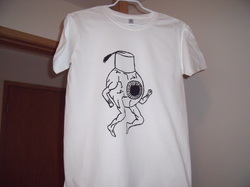 Non-Etsy quality product photo. For my warm-up I was to choose a motif to explore over and over again in my work. I think there is a motif that has found me: leaves. I don't know what it is about leaves, but I keep using them. They all look different, of course. At least most of them. I would have liked for my motif to be trees (which are very symbolic for me) but my trees never really turn out. So leaves it is. For my podcast, I listened to the conclusion of the lecture that I was previously listening to, about craft and social movements in India. Today, there is a lot going on in the world of Indian crafts. Crafts are considered to be part of the heritage of India, but they are generally being replaced with mass-market goods, often from China. Sometimes Chinese mass-market goods are even made to look like Indian crafts! There are special stores, including government stores, who sell Indian crafts, and the growing middle class in India, who want quality products, is a new market for the crafts, as are craft collectors overseas. Some Indian crafts are of exceptional quality, as are the blockprints in this link. Notice how many steps are involved in creating the beadspread. However, some Indian crafts are not of such high quality, and the presenter didn't believe that people should buy the products just because they were handmade. He wanted to work with artisans and his design students to develop better products that would appeal to a larger audience, especially those who want something high-quality and don't care if it's handmade or not. There have been many problems with the artisan community in India. Most live below the poverty line, and people sometimes steal their ideas. The concept of intellectual property rights often a new idea to these people. There have been a number of suicides as people have watched their livelihoods become unviable. Often the artisans are women, who face additional social, economic, and political hurdles. However, artisanship is the second-largest employer in India (the first being agriculture) so it is essential to the economic development of the country. The speaker wanted to help the artisans use crafts to lift themselves out of their poverty and experience dignity. I continued to work on my yarn-ball drawing. It is coming along, albeit slowly. I'm still not very happy with it. Unfortunately, it is the ball of yarn I've been weaving with, and I've run out of yarn on my shuttle, so I can't continue to weave until I've finished the drawing. I don't want any more scenes changing on me before I've finished them! 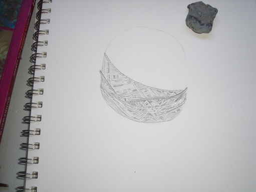 That weird grey thing is a kneaded eraser. 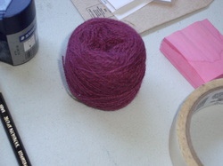 The subject. For surface design, I tried two new techniques: Elmer's school glue resist with watered-down textile paint, and pole-wrap immersion dyeing. I have washed both out now and will post photos when they are dry and ironed.
Today, I started out with business study. I have now estimated all of my start-up costs and most of my monthly costs. The start-up costs are reassuring: I probably won't need a bank loan. However, my monthly costs are scaring me. I have no idea how many transactions to expect in a given day, and there are only two days of sales, and my products will be priced pretty high so I don't know if I'll be selling lots of them. I certainly hope I do! But there's no guarantee. But I suppose I will really only have to make about $200 a day to make those costs, which is one or two sales. If I could make two sales a day at that silly Catholic Church craft fair I attended last year, I could probably make more than that at the Portland Saturday Market!
Design. Oh, design. I wish this book had assignments because I am sucky at coming up with them on my own. Today's chapter was about shape. Shapes can imitate natural forms or they can be imaginary and abstract. There are geometric shapes, which we are all familiar with from elementary school, as well as biomorphic shapes, which suggest natural forms or forces (you could have a shape like a human body, or what you thought the wind looked like). Shapes do not have to have distinct boundaries: they can be suggested through closure, or implied shape. There is also amorphous shape, which is a blurry image which suggests a shape. Shapes can either be two- or three-dimensional, whether in sculpture or a 2-D picture plane. Mass refers to shapes on the picture plane and volume is the empty spaces. Shapes can appear 3-D while on a 2-D surface (plastic). This can be achieved by tilting the shapes in space, foershortening them, overlapping them, or grading the color, value, or texture. This is especially important when representing shapes like spheres or ovoids that do not have any flat surfaces. Use of perspective is one way of making shapes appear 3-D. A weird and cool effect can be created when the perspective lines tilt toward the viewer: it looks like you are looking through the shape. Some artists use 3-D effects without using perspective: medieval artists did not know about perspective, and more modern artists sometimes find it too constricting. Shapes can be used for the same compositional aspects that we previously studied: harmony and variety, either in the shape itself (a repeating motif) or the lines or interior shapes of the image; dominance, or making one shape more dominant than the rest of the image; movement, or the interior lines of viewing the shapes within the image; balance, in which we consider the visual weight of the shape, the negative area around it, the placement, size, and emphasis of the shape. I will continue with the shape composition in my next study.
I hope to continue to work on my stepmom's scarf today as part of my personal projects. I also might go over and review things in my design book to see how well they are actually sticking. The point of all this is to improve my design, after all.
I have a new resolution: I will not try to do everything every day.
I could do it fine for the first few days, but I was getting increasingly tired and less motivated. Also, I didn't have enough time to work on site development, networking, and all that kind of thing. So I am going to give myself shorter studying days with more time for non-studying projects. I also resolve not to be working nine or ten hour days. To some people, it might not seem like a lot, but with my disability, it really is too much.
Yesterday, however, I did do a full day. I didn't intend to, it just kind of happened.
I started out with my podcast. I had some errands to do and listened while I did them. The presentation was by a very distinguished professor in India who talked about how craft has been essential to the Indian identity. He said that in the various Indian languages, the word for "craft" also means "art", "architecture", and various other similar things. This is an idea I can get behind! I am very interested in blurring the lines between art and craft, as I think it's a bit of a false dichotomy, and in some cases it offends my feminist leanings (often, things that men have traditionally done are considered art, and things that women have traditionally done are considered craft. It's not a hard and fast rule, but it is a trend.) He talked about craft from the earliest known times of settlement of the Indus Valley region--of course, evidence of craft is one of the first evidences of civilization. He also discussed how the Mughal Empire brought Islamic-style art to India, as evidenced in the Taj Mahal. Most interesting to me was the association of craft with independence from the British. Early on in British rule, the British cut off the thumbs of weavers so that they would not be able to weave, and Indians would thus have to purchase British cloth. When Gandhi began to envision a free India, he wanted to make sure that British oppression would not be replaced by Indian oppression. He believed that increased self-sufficiency was the answer to that. In order to achieve that increased self-sufficiency, Indians needed to re-learn to produce their own crafts. Gandhi focused on spinning, and taught spinning to his disciples at his ashram and even to Jawaharlal Nehru. He designed his own portable spinning wheel that he could take with him on his travels and even to jail, where he spent a fair amount of time. This is why there is a spinning wheel on the Indian flag today. The flag also has to be spun with the same kind of hand-spun Indian cloth that Gandhi made, as I have just learned from Wikipedia.
Next I decided to experiment with doing an Elmer's school glue resist on cloth. I applied the resist (and used half the bottle, so good thing it's cheap!) and had to wait for it to dry. I also prepared several small pieces of cloth for continued experimentation. But that was all.
I continued drawing my ball of yarn. It continued to drive me crazy. When I look at it with fresh eyes, it's not so bad, but when I work on it for a while, I am acutely aware of how far my drawing has to go. My biggest problems are that I am not very good at estimating negative space, so things always end up in the wrong spot and I don't realize it until I try to fill in the detail, which doesn't match up; and that I don't have a good grasp of shading and value. I do shading, but it never quite looks right. I don't yet have the tools to identify what it is that I am doing wrong.
In design, I finished the chapter on line. Line also possesses character, that is, what type of line is made with the medium at hand, and how it is applied. It could be blurry or sharp, thick or fine, dotted or smudged, etc. There are other elements having to do with line as well. Line and shape involved contours, the outermost limits of a figure, and cross-contour, like what you see on a contoured map. Line and value has to do with types of shading that can be achieved with line. You can do this by controlling how close together the lines are, or by varying the thicknesses of the lines. Putting parallel lines together to create different values is called hatching, and you can achieve darker values by making those lines perpendicular, called cross-hatching. There is also line and texture, which is how the line appears on the surface. This is created by the different media that can be used. Additionally, there is line and color. The color used will change the impact of the line. There are spacial characteristics of line: thick lines appear to be closer and thinner lines seem to be further away. Lines can modulate from thick to thin and have an impact. Line can also represent emotions or states. Gestural drawings are based on an artist's initial impression of something and tend to have loose, flowing lines. There are also calligraphic lines, or lines that imitate calligraphy (but can be used in any typer of art). Additionally, there is implied line, or lines that are suggested by the lines and shapes around them (remember closure?) Finally, there are three-dimensional applications of line: we tend to see lines where there are edges in three-dimensional work. Sometimes lines are incised in clay to bring a certain image out.
Finally, I worked on my business study. My husband and I discussed getting my online shop back up. One of the problems with my shop is that I have horrible pictures, so I re-took pictures of my products. I'm not sure they're any better, however. Master photographer I am not.
Today I endeavor to do half of what I did yesterday. So shorter blog posts, hopefully.
Also, my camera situation has been resolved, and the camera is charged. At the moment, I am loading those photos onto my computer and it is taking a long time, so I will have some new photos later today or tomorrow.
Yesterday I only worked a little bit on my education. I was having guest over so I had to prepare for most of the day (I was cooking a bit of a complicated dinner). So I only worked on Design and Surface Design.
In my design book I read about attitudes that people have when viewing art. Some art is difficult to understand, particularly if it is in a new form. Sometimes the public reacts negatively to a work of art, which occasionally means that the art has to be removed and even sometimes destroyed. I learned about how to develop ideas as an artist: looking for stimulating ideas in your travels, observe how people relate to each other, study nature, doodle, or look at existing artwork, for example. I learned about critiquing and analysis: examine the subject, form and content and see how each of those measures up. I learned about basic concepts in two-dimensional art, such as having a flat plane or three-dimensional effect, and how the picture frame can be in any shape you want, not just rectangular canvas. I learned that negative areas are just as important as positive areas. In three-dimensional art, the shape, mass, and volume have to be taken into account. Sculpting includes several methods for creating: subtraction, or taking away material; manipulation, or modeling; addition, or adding materials onto the item; and substitution, or casting. Finally, the chapter discussed some three-dimensional art forms that use these methods: sculpture, architecture, metalwork, glass design, ceramics, fibers (yay!), and product design.
I also worked on washing out the dye from my low-water immersion dyeing experiments. Washing out dye is my least favorite task in surface design. I think it took me about an hour to get it all out. Here are the results:
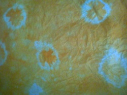 This is tie-dye. 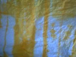 This one was pleated. I made the pleats into different sizes. 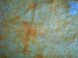 This one was scrunched into the toe of old pantyhose. 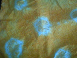 This one was tie-dyed using little pebbles. The circles are smaller, rounder, and more regular than the plain tie-dyeing. 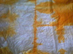 This one was folded into squares. It was an interesting experiment. My favorite were the tie-dyes and the scrunching.
Today I had a full day. I started with the warm-up that I missed last time, making a little altered-art card. I took a map and found Spokane, where my husband did his undergrad. I gave it as a gift to him. 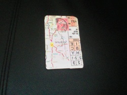 This is a horrible photo, for which I apologize. It's also backward. I regularly lose the battery charger for my camera, so I take a lot of bad photos. Next, I listened to a podcast. It was a lecture by a woman who was an expert in Indian cotton. It was quite a fascinating lecture. India has been producing cotton cloth for tens of thousands of years! More recently, in the middle ages, there has been a lively trade with Indian cotton in Arabia, and Persia. They started to trade with Europe when the Portuguese came in the fifteenth century, and have traded with both the Dutch and British East India companies. They have also traded with Indonesia, Thailand, and China, where Indian cotton was very highly prized and worn in the royal court. India has a rich tradition of textile arts involving cotton: the block printing of Gujarat, embroidery, ikat, and other decorative weaving. It is difficult studying the history of textiles because textiles tend to deteriorate after a hundred years or so. In India, these cloths have been used until they were dead, and so most information about Indian textiles comes from the places they've traded with.
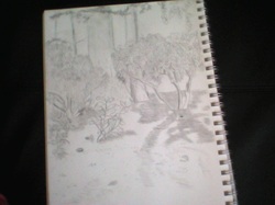
I finished my drawing in the park today. I drew as many leaves as I was willing to draw. I wanted to draw the gravel but there was no way I was going to draw each and every pebble. Also, somewhat annoyingly, some of the details that were on the ground before, such as pinecones, were blown away by leafblower before I could get started. Who leafblows a path? 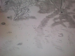 Again, sorry for the terrible photographs. Next I worked on design. The chapter I am on now is about form. Basically, I looked at the principle of harmony that can exist in a work. This can be achieved through repetition, rhythm (a concept I am still trying to get my head around and don't understand well enough to describe yet), pattern, closure (when your brain supplies missing information), visual linking in which two items touch each other, linking through extensions (in which there are items in the visual that form shapes by themselves, such as a triangle around three heads) and the problem of excessive use of harmony, which creates monotony.
For surface design I am overdying my just-dyed cloths using the same methods I used previously. I used the same low-water immersion dying that I did last time, but with blue dye this time.
In business, I started studying finances. I am having quite a bit of trouble with this part. I am not very good at crunching numbers and complex formulas really confuse me. I will probably have to have someone help me out with this part. I have to estimate start-up and ongoing costs, which is going to take a fair bit of research and can't really be done in one day. I have to figure out my own wage, which has me quite surprised because the authors insist that I must pay myself well. That would mean making more money than I have ever made before--a lot more. Like double of my previous best. I am still kind of shocked that it may be possible for me to be middle-class with my business. Can that really happen with art? The authors seem to think so. So this amazing wage that I am paying myself is to be calculated into the price of the items I am making. Of course I still need to figure out my material costs, because I honestly have no idea what I spend on materials.
Now, I'm going to play around with my website a bit to see if I can't spiff it up!
Today was my second day of my un-BFA. I got started a bit early because I was excited and knew that I had a trip to the library, which would take up some time.
My warm-up was non-existent: I thought I didn't have the materials necessary, but I found them this afternoon. I forget what all I have. My husband, Jason, gives me odd random things that he thinks I can do something with. Usually, I can. So I might work on that activity tonight while dinner is cooking or something. It looks like one that will work for me. It's about taking a little piece of formica sample and using that with paper ephemera, stamps, and odd bits and making a keychain out of it. I don't have the keychain components but I can make the little thing anyway.
I listened to the next podcast on my list while I wove. It was a short one, which was the question and answer period to the previous podcast I had listened to, about the fiber artist from Nigeria. Most of the questions were about the subjects in his work and how long he dyed his fabrics for (the ones with resist, he had to dye quickly in order to keep the resist from falling off.) So I didn't learn much that I didn't learn from the previous podcast, but I still think it was worthwhile.
I had to pick up my design book from the library, which took a chunk of time as I had to walk. I am using Fundamentals: Theory and Practice, 11th ed. by Ocvirk et al. It's a textbook, so I didn't make a lot of headway with it. I went through about 20 pages before I had information saturation. This included a glossary and an introduction to the concept of art and how it evolves over time. It also introduced the three components of art: subject (what the work is about), form (which includes line, texture, color, shape, and value), and content (the message). When these three things are in some kind of balance, they form organic unity, or a work that has a sense of completeness. There was also a section on abstraction and the different levels of abstraction: Naturalism, or the completely representational; Realism, which is representational but is more about an emotional state; Semi-Abstraction, which is partly representational but may be simplified or rearranged; Objective Abstraction, which is based on a physical object but has been so abstracted that it is no longer recognizable; and Nonobjective Abstraction, which is not based on any physical object.
After that I went to the park to continue to work on my drawing. I continued on the same scene as before. I worked on another bush, which was equally crazy-making as I was attempting to draw at least most of the leaves as I actually saw them. The leaves were drooping more yesterday than they were today, so my bushes look more different than they are supposed to. I also worked on some of the trees behind the bushes, but not any leaves. I got to use my blending stump for the first time. I love my blending stump! In high school art class, I was taught never to erase (I don't know what that was about) and to blend with my hand. You can imagine my delight when I recently discovered kneaded erasers and blending stumps. The erasers can be shaped to fit inside tiny spaces, and the blending stump is much more precise than my hand. Also, it's nice not to have my hand and everything I touch covered with graphite. I didn't finish the drawing yet, as I still have leaves, gravel, and mulch to work on. This might take me another couple of days. I drew for about an hour, which is a long time for me to sit down. My husband has suggested an easel, which I am keen to work on but not so keen to carry or purchase.
For my surface design "class", I worked on immersion dyeing with various resisting methods. I did tie-dye (which doesn't have to look like a hippie did it), tie-dye with pebbles, scrunching, pleating, and folding. I used a small amount of dye in plastic bags and they are batching right now. I am not sure how they will turn out, as I don't know if I added enough dye. I like to err on the side of not enough, because I hate throwing unused dye down the sink (it's kind of a nasty chemical) and because you can always overdye. I will wash them out tomorrow and see what the effects are. I will add pictures of the effects.
For my business "class", I worked on a simple business plan. This included defining what I was selling (not just the product but the idea behind it. It made me realize that I need to be more focused in my products. "Fiber arts" is too broad of a category for a one-woman operation. I have narrowed it down to surface design items that can be used everyday, but I haven't decided if that will mean home decor items or something like scarves. I had to define my business's personality (otherwise known as branding, which is not a term I particularly like). I decided that my business will be laid-back, sensual, artistic, beautiful, cutting edge, and a dreamer. It will have the ability to connect with others' sense of beauty, and exude independence, woman spirit, pride, and simplicity without plainness. Next I had to define my customers. I have decided to target mostly women, as the preservation of traditional women's art is important to me and a part of my brand. They will be more affluent than myself (at least until I'm making money!) but not filthy rich. They will share a love of art and beauty. There are many more items but I won't list them all or we'll be here all day. The most fun exercise was inventing two of my own customers, with their jobs, likes and dislikes, hobbies, dress style, favorite films, etc.
I did not work on my personal projects yet, at least not so far. Yesterday I knitted up a storm while watching TV. I finished the sleeve I was working on, and am ready to start the other sleeve. If this project works out, it will be my first wearable-in-public sleeved sweater!
Today, August 29th, was the day that class was supposed to start at my art school. (I assume that it has started even without me there!) So today was the first day of my un-BFA. My husband printed out an acceptance letter, some posters, and some stationary for me. My friend Melanie is making me my own student ID, which was mentioned on the unCollege Facebook page.
My warm-up today didn't go that well, as these things sometimes do. It was for an art-journal house. I think if this was the only project I was working on today, it would have worked, but I didn't have several hours to spend constructing that thing. I am still a little iffy on what an art journal actually entails. I am not sure how it is different from a sketchbook, and if it is like a "writing" journal, how to put my thoughts into a quick-ish composition. Usually if I need to express myself visually, it turns into a major project.
I listened to a podcast from Maiwa Podcasts today. Maiwa is a fiber arts institution in Vancouver, Canada, where I am from. They have a import retail store, a supply store, and a yearly symposium. The podcasts are from lectures from their symposiums. The one I listened to today was a lecture from a fiber artist from Nigeria who now lives in Santa Fe. He is unusual in his culture because usually women are fiber artists. He has always been visual. He uses traditional fermented indigo to dye, and uses tie-dye techniques, as well as batik. He uses a type of sago paste for resists. His work is usually depictions from his life. While I listened, I wove a twill pattern on my four-shaft table loom. The repetitive nature of the weaving helped me pay attention to the lecture.
I went out to the park to do some drawing. I sketched out a little scene with some rhododendron bushes and some trees. I worked on the detail for a few of the bushes, but one bush in particular was especially crazy-making so I will go back to it tomorrow and continue to work on the scene. I will post a photo of it when it is finished.
For my surface design assignment, I finished up a table runner for Melanie Wallace. I can't reveal too much about that yet, because she hasn't seen it! I can't wait to show it to her.
For my business study, I read and completed the exercises from the first chapter of The Boss of You. I identified my business goals, defined my personal measure of success (which is not to become a Fortune 500 company), and identified my strengths and weaknesses. So far, I love this book. It's perfect for people like me, who just want a happy little business with a sustainable wage. I'm super-pleased with it.
I did not work on design because I haven't got the book from the library yet. I also didn't work on my personal project today, because I didn't have time and i did get the chance to work on Melanie's project and my weaving. I might do a bit on knitting after dinner though.
I am working on my website right now (obvi) and hope to improve it more over the next few days. It's still looking a little ghetto but at least it has content now.
I am very happy with my first day. It's ended up being a nine-hour day, which is remarkable for me. I have a disability and usually have to work part time, but I have so much energy right now. I haven't had a full day's work in a long, long time. I am not sure how long it will be once I have my warm up, design, and personal projects elements tied in. It might end up being quite a bit longer. I will have to see if I need to adjust the schedule, or if I will just work longer.
Happy first day of unCollege for me!
|
 RSS Feed
